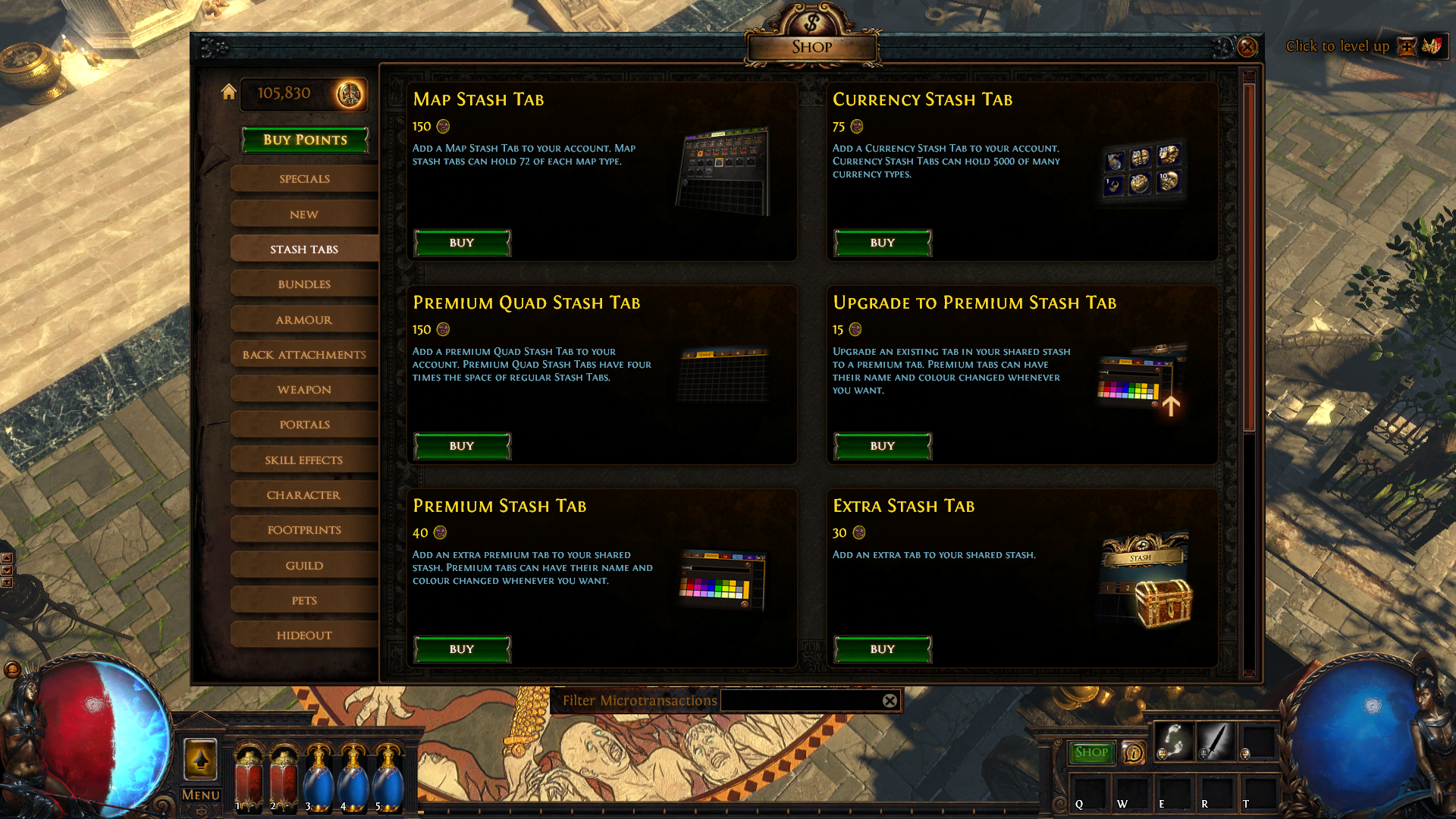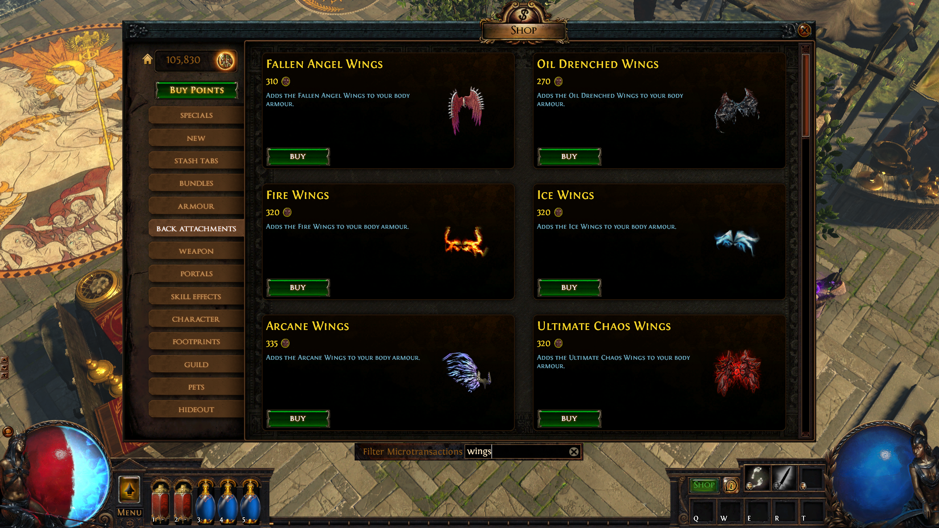
In a patch in the near future, we're making some cosmetic improvements to the in-game microtransaction shop's layout and appearance. While these initial changes have limited functional impact, they will create a framework that allows us to make other improvements more easily. We want to get these improvements out as they're ready rather than delaying them to all be released together.
The first initial improvement is that the appearance and layout of the shop is changing. It will be much larger, clearer and appear in the centre of your screen for easier navigation. We've also reorganised the categories with the intention that microtransactions should be easier to find. 
There's also a filter function that will allow you to find microtransactions within their categories by name or key words like "helmet", "wings" and so on. 
We have more plans for future improvements, which we will roll out as they are ready. One of our most impactful plans is a tagging system that allows you to refine your searches by theme and use tags to cross reference themes or microtransaction type. For example, searching for "fire" and "armour" would allow you to find fire-themed armour microtransactions like the Deicide Armour Pack or Infernal Armour Pack. We would also like to add a setting that allows you to hide microtransactions that you already own. There are certainly other improvements that can be made. In addition to our plans, we have read some great community feedback about how the shop can be improved and will be integrating as much of it as we can into this new system. In the meantime, we'd love to hear your thoughts on this new setup and any suggestions you might have for future improvements! |
|


